Web Refresh Update: What’s Changing and How to Prepare
The Web Brand Refresh project continues to move forward with our partners at iFactory and Modern Campus. The project will modernize UND websites to better align with the University’s updated brand standards while improving accessibility and readability across all devices.
While much of the work is happening behind the scenes, there are several changes that web content editors should begin preparing for now.
Top 5 Campus Wish List
During the discovery phase, iFactory conducted stakeholder interviews and gathered feedback from web content editors across campus. Many of you shared a similar wish list of improvements you’d like to see addressed.
1. Stronger Heading Hierarchy
Editors wanted more distinction between heading levels and less green heading styles. We frequently see H3 headings used where H2 headings should be used because H2s feel too large. This creates accessibility issues because screen reader users depend on properly structured heading levels to understand page organization. The refreshed design has an improved heading hierarchy that addresses these two concerns.
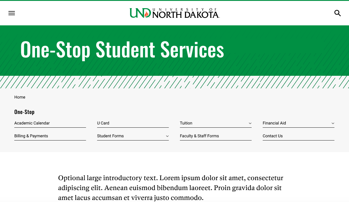
2. Change Left Navigation on Desktop
One of the most common requests was to reduce the amount of screen space consumed by left navigation on desktop devices. We heard the current placement limits content width, reduces the impact of full-width snippets and encourages adding content to fill the empty white space under the navigation file on desktop.
The refreshed design moves navigation horizontally across the top of the page on desktop while maintaining the “hamburger” experience on medium and mobile screens. The change in placement does not impact your site’s navigation structure or content. The change is simply where navigation is displayed on desktop screens.
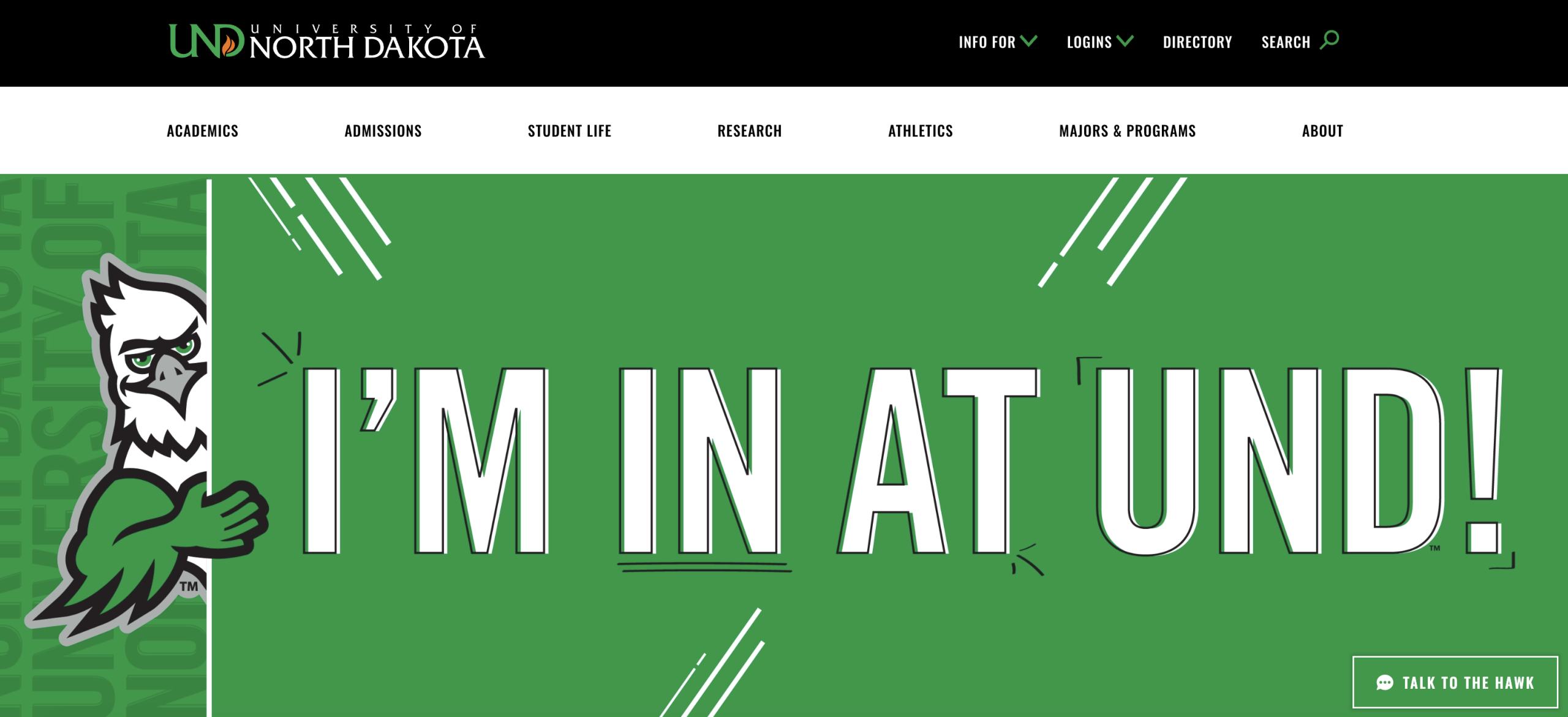
3. Improved Hero Billboard Design
Many felt our large hero billboard images and H1 page titles consumed too much vertical space before visitors reached page content. Changing billboard image sizes would require campus units to resize hundreds of images, so we intentionally chose to keep the current billboard image size. Instead, we incorporated a slightly smaller H1 page title into the hero area to free up vertical space.
4. More Flexibility for Interior Pages
Landing page elements have become popular throughout the CMS, even though they were originally intended for a limited number of high-traffic pages. The refreshed design will provide more flexibility by making some of those visual elements available beyond traditional landing page templates.
5. Updated Snippet Styles
Many existing snippets, particularly those using gray and black backgrounds, were identified as looking dated. Snippets throughout the CMS are being reviewed and refreshed.
Campus Feedback Helped Shape the Designs
On April 15, 2026, more than 200 people attended an iFactory Town Hall presentation showcasing prototype designs for the UND home page and universal template, which is the most commonly used template. Invitations were sent to nearly 800 CMS users and Website Improvement blog subscribers.
Following the presentation, invitees received access to the recording, slide deck, prototypes and a feedback survey. The survey responses and Town Hall comments were compiled into a formal set of recommendations that helped shape the final designs.
The finalized designs can be viewed in Figma but are not functional websites:
What Editors Need to Do Now
To prepare for design changes, it’s important to start reviewing your content now.
Review Your Navigation Structure
The most significant change for many sites will be the move from left navigation to horizontal navigation on desktop screens. The new design will support your existing navigation structure and can include dropdowns, but it also makes long navigation menus much more noticeable.
If your navigation contains more than eight primary items, evaluate whether all those items belong on the same level. In many cases, content can be reorganized into a nested navigation, which groups related content under a broader parent section.
As you review navigation, remember that restructuring folders can change page URLs. Before moving pages, verify that pages are linked using dependency-managed links to avoid creating broken links and consult Marketing & Communications for assistance.
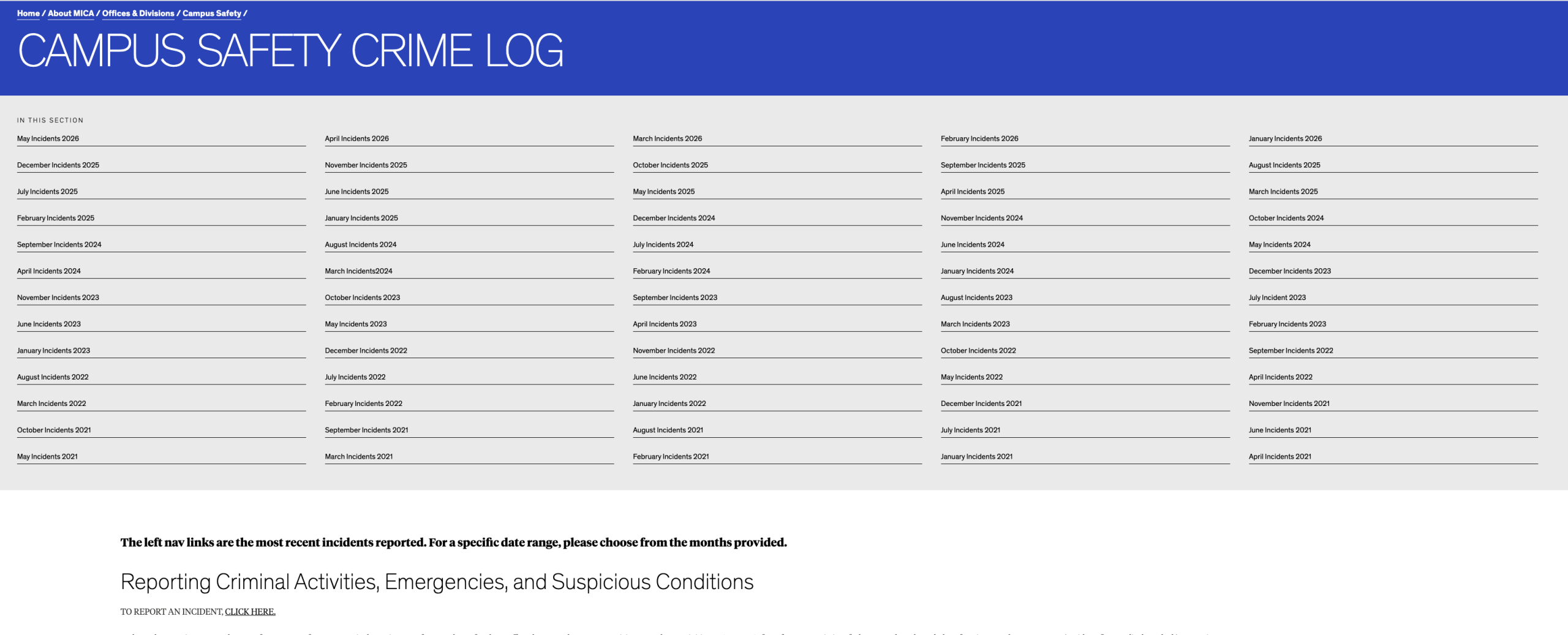
For inspiration, we recommend visiting the MICA site which was used as a model for our new desktop navigation design. While MICA navigation does not support dropdown navigation like UND, it provides a good example of nested horizontal navigation in practice. However, there are instances where the navigation wasn’t used correctly. Visit the MICA Campus Safety Activity Log as an example of what long navigation files will look like on desktop.
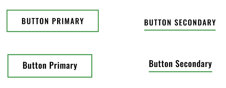
Review Button Text
To improve readability, buttons will no longer automatically display in ALL CAPS. The current design forces button text into uppercase regardless of how it is entered. In the refreshed design, button text will display exactly as they are written. Because some words legitimately need to remain uppercase, such as UND or FAFSA, we cannot automatically convert button text to title case.
Unfortunately, there is no way for us to determine which buttons were intentionally written in ALL CAPS and which rely on the current styling to force uppercase text. We have also found examples where button text was entered with inconsistent capitalization, such as “read MorE,” which would display exactly as written in the new design.
To help identify content that may need attention, we are working with Siteimprove to determine whether a policy can be created to flag button text with capitalization issues. In the meantime, editors should begin reviewing button text throughout their sites to ensure it is written as intended.
Review Billboard Content
The new universal-template billboard design will no longer support:
- Fly-in text
- Green arrow background overlays
These fields will be removed as part of the refresh. Please review your pages and determine if the fly-in text should be incorporated elsewhere on the page. If you currently use the green arrow background overlay, it will be replaced with the green pattern shown in the prototype.
Also, if you have billboards with decorative words like the Admitted Freshman Student Checklist page, those images should be replaced with billboards without words because the H1 is moving into that area.
Continue Cleaning Junk Code
Pages containing unnecessary formatting, copied-and-pasted content or excessive inline styling may override new designs.
Please continue using Siteimprove to identify junk code. The cleaner your content is today, the smoother the transition will be when the refreshed templates are launched.
What’s Next?
The question we receive most often is: “When will the new design launch?” The honest answer is that we do not know yet. We are moving as quickly as possible, but we’ve learned that adapting a brand system developed primarily for print materials to a large web ecosystem is more complex than anticipated.
The next phase of the project focuses on updating additional templates and CMS snippets. As designs are finalized, we will continue to share so editors have time to prepare.
We are also working with iFactory to improve training materials and help documentation that will accompany the refreshed designs.