Web Refresh Batch 3 Designs
If you’re new to the website refresh project, start by reading our previous updates.
The web refresh project moves forward, and Batch 3 designs are done. You can now review Batch 3 in Figma:
We recommend viewing the prototype links above to see the full screens in all sizes.
Blog Article Template
The Blog Article template is used within the Programs Blog site but could be used elsewhere for journalistic and editorial content. Unlike standard webpages, the blog template includes a publication date and author and allows content to be distributed through RSS feeds.
The screenshot below is the refreshed design for a live blog post. Visit the live page to compare the difference.

Contact Include
The _contact include used on most Universal templates will move to the bottom of the page on desktop because the left navigation is moving to the top of the page in a horizontal banner. The _contact include will remain at the bottom of the page on medium and mobile screens as it does now.
The new design gives contact information more prominence. We’ve noticed many pages repeat contact information within the page content. The more prominent design should reduce the need for editors to duplicate contact information elsewhere on the page.
If you’ve added content outside the Contact Information snippet in your _contact file, such as office hours or hyperlinked buttons, that content will need to be reviewed before the new design launches to ensure it’s displaying as intended in the refreshed design.


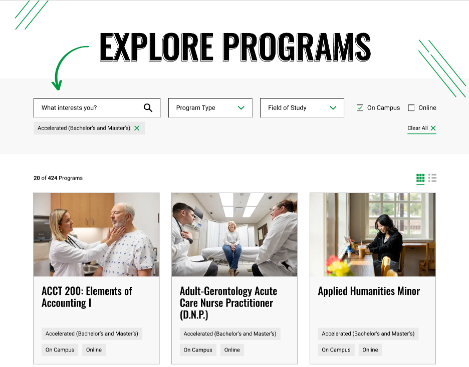
Program Finder Index
The refreshed Program Finder home page is more inviting and streamlines the search and filter experience. The biggest change is a smaller search box on desktop. After reviewing search data, we found about 99% of Program Finder searches are very short, such as “nursing” or “commercial aviation.” Users aren’t typing longer questions like they might in a traditional search engine, so we were able to reduce the size of the search box and bring the search and filter options together in a more compact layout.
Online Course Finder
The current Online Course Finder has an accessibility issue because the +Details button on individual courses interrupts how screen readers read course information. Given the +Details functionality needed to be removed, we designed a simple list view with expandable accordions to review all course content in one window. This also allows users to easily scan course options, which is helpful when displaying about 1,000 courses at once.

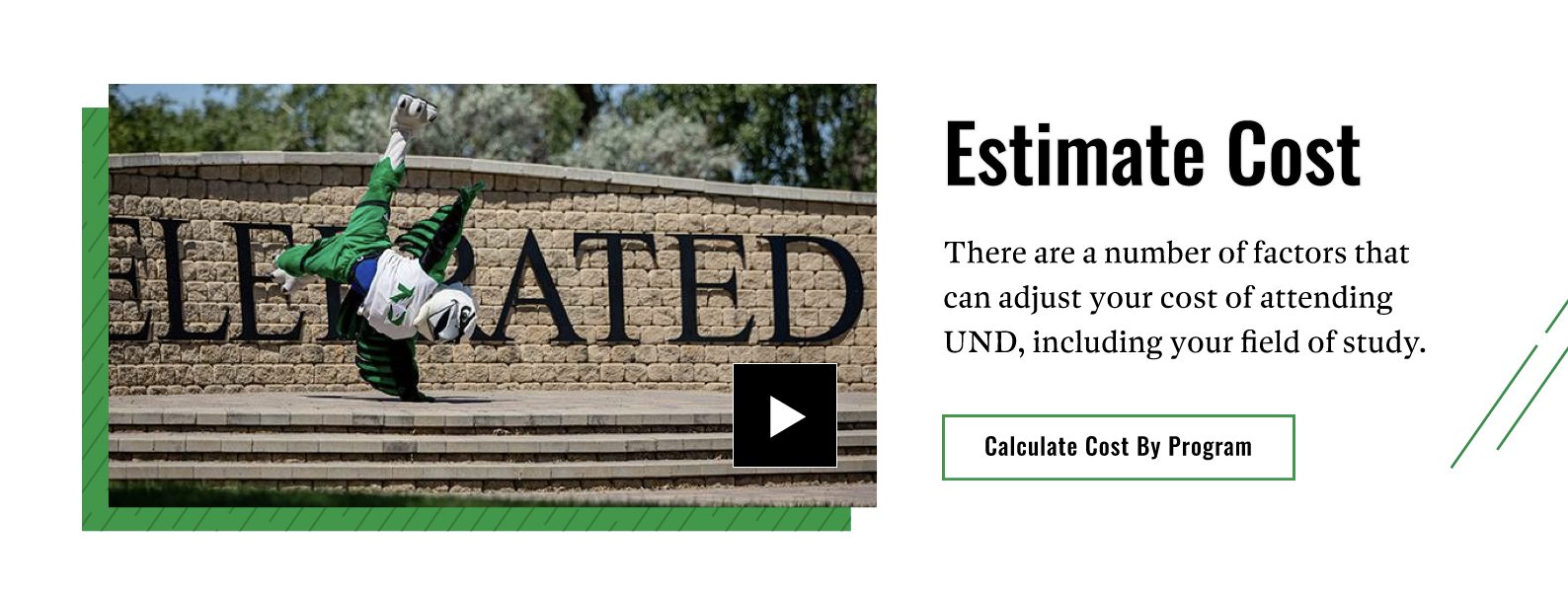
Tuition Calculator
We had some fun with the Tuition Calculator! The layout and functionality remain the same, but we added playful brand elements to freshen up the design.

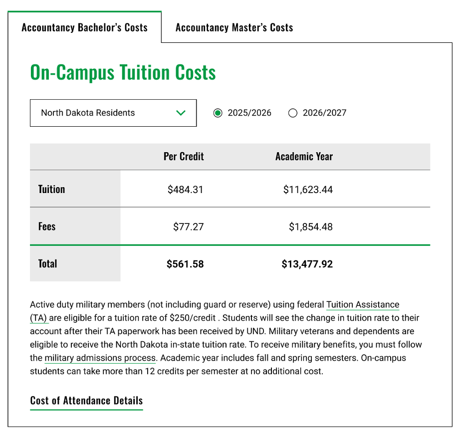
Tuition Tables and Tab Snippet
Every Cost page in the Program Finder has a tuition and fees table populated from a database. We applied a light design refresh to these tables and tightened alignment. The prototype also shows how the refreshed tabs snippet will look. Tabs are only used for accelerated program costs, but the tab snippet is widely used on many pages.
Center/Organization Template
Center/organization templates presented a unique challenge because many of these sites have their own brand standards and do not want to inherit the UND brand. For this reason, we intentionally removed UND brand elements and created a more basic design. The color options of UND green, dark blue, maroon or brown were unchanged.
The trade-off is that these sites will look more plain, and large color blocks will be present, especially if the snippets were not used as intended.
Example of Removing Brand Elements

Centers Headers
Centers header will retain the three options currently available to have a header with or without a logo and with or without a separate global navigation file.
Display Option 1
Option 1 includes global navigation for the center/org website, a logo, and the name of the center/org written out similar to the style used on the college/school sites.

Display Option 2
Option 2 is for smaller sites without global navigation, allowing us to shift the logo and name to the left.

Display Option 3
Option 3 is for smaller center/org sites without global navigation and do not have a unique logo.

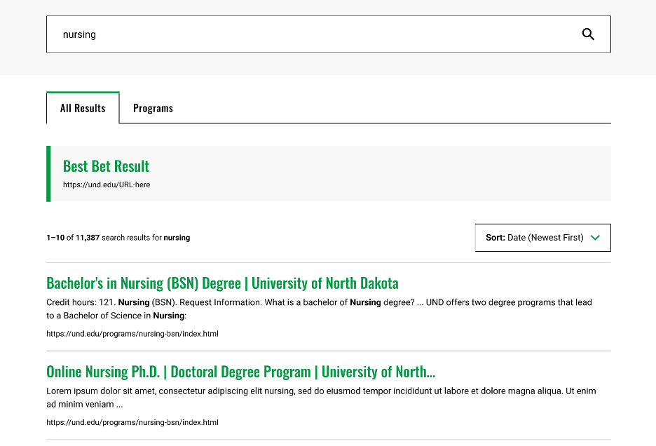
Search Results Page
We worked with our search vendor, Funnelback/Squiz, to review current best practices for higher education search interfaces. We discovered, and our analytics confirmed, that the related searches (left column on desktop) are rarely clicked.
The refreshed design removes related searches, which allowed us to display search results in full width on desktop. Suggested searches and matching programs will appear in a dropdown as users begin typing.
AI-Powered Search
The long-term goal is to replace traditional site search with AI-powered search. We explored Squiz’s AI search capabilities, but the technology is not mature enough. We’ll continue evaluating Squiz and other vendors as AI search evolves. So far, we have not found a solution that meets our accuracy, technical and budget requirements.
What’s Next
We’re moving on to Batch 4 design while programming continues for Batch 1. We’ll also soon kick off a new training project with iFactory to overhaul our Modern Campus training based on feedback we’ll soon collect from web content editors.